


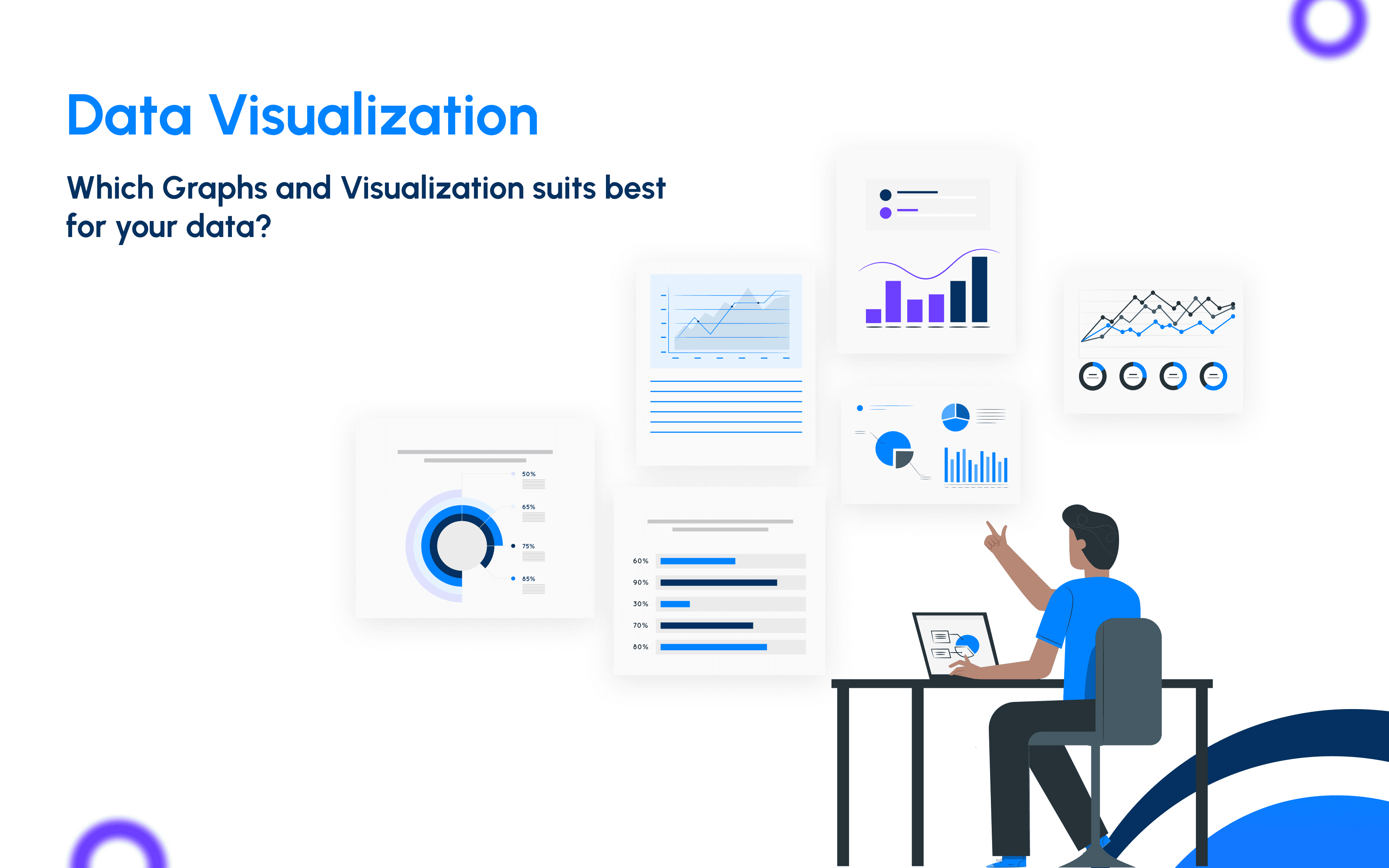
If you are building a product related to financial data analysis, data visualization and data interpretation, then graph selection also plays a crucial role. Properly selected, this graph and visualization could create a good impact in understanding the data. Let's go through the graphs that could help properly visualise data.
Line Graph

The line graph is sometimes viewed as old-fashioned, but it really is a very efficient means of displaying data. This approach does a fine job at showing how things change over time and is especially useful for trend analysis.
For example, line graphs in stock market prices indicate the trend. Lines connect a series of points showing an increase and decrease in prices over some time. This, in turn, makes it easy to see patterns and trends, hence helping people get what's happening in the market.
Even though many new types of charts have been invented, the line graph has remained in demand simply because it is very good at indicating changes over time. Be it stock prices, weather data, or any other type of time series information, a line graph is often resorted to just to know how things move with time.
Pie Chart

Probably, a pie chart is the most popular and easily recognizable chart in data visualization. Because of the general simplicity of its design, it became a very versatile instrument for data presentation, not depending on whether it was used by novice or professional data analysts. The key strengths of a pie chart are in graphically representing percentage distributions in an intuitively very comprehensive way. One of the most efficient ways to express something as divided into parts of a whole is through a pie chart. Pie chart shows the comparative size of different categories against a dataset.
Now, adding interactivity to a pie chart gives more insight. Interactivity will provide an easier route to get more dynamic engagement with the information, and thus a better understanding of the material presented. "Drill Down" is an important power interactive feature that may take users through various levels of detail regarding the data. For example, Under the equity section, there is further sub-classification of Total Listed Equity and Total Non-Listed Equity. Now, we can add a proper drill-down from Equity to its children to view them properly. This kind of multilevel exploration will give an extended view to the user about the data that will be very much helpful in discovering patterns and trends which are hardly perceivable in a flat chart.
Bar Graph

Bar charts are very common and are very popular because they are very useful. A bar chart uses rectangular bars to show the data. The length of each bar shows the value of the data and so is always appropriate for comparing different groups, noticing changes over time, or showing how the dataset is spread out.
One major advantage a bar chart has over a pie chart is that a bar chart can represent not only positive but also negative values; this is something pie charts do not achieve so easily, as they are circular. This makes the bar graph more suitable for the representation of data including both gains and losses or positive and negative growth.
For instance, a company's financial growth could be increased at one time and decreased at another. In such instances, the bar graph would be the perfect graph since it has the capability to display positive values in one direction and negative values in the other. This puts the data into a prospect for a clearer and fuller view, hence easy to analyze and interpret.
Tree Map

One of the important visualization tools is tree map. It provides a very different set of advantages from pie and bar charts. Where pie charts are limited in showing only percentage distributions, and bar charts are more apt for comparing values or showing positive vs. negative data, the strengths of treemaps lie in the compact representation of hierarchical data.
Treemaps are basically applied to show the proportions of parts to a whole, and because of this, they are very well suited in cases where data has more than one category ranking. Here, each rectangle designates a category where its size on both axes will be proportional to the value. This form of geometrical layout provides good space efficiency, meaning that many categories can be compared simultaneously.
A good example is a treemap on different deposit rates of a bank, as depicted by the visual. This treemap has various rates for its individual and institutional fixed deposits, savings, and call deposits. Thus, every portion—for instance, "More than 5 years" or "1 year"—will be proportional to the rate or value it represents. This allows for easy comparison of various rates and categories at a glance, in order to obtain an overview of how different deposits contribute to the overall data.
Perhaps the main advantage of treemaps is that they are capable of displaying a hierarchy and the relative size of all categories in just one plot. Thus, you will have a good overview of the structure and proportions of your data. For example, in the deposit rates treemap, you will see how the different terms and types of deposits stack up against each other by size and rate.
KPI

The KPI dashboard forms a very important constituent of data visualization. It gives advantages over the traditional charts by offering a snapshot of key metrics in one glance. Unlike a pie or bar chart reflecting a single data point, a KPI dashboard will list such critical indicators as total assets, deposits, or profit and loss in a very small space. This can provide an instant feel for performance and trends, so it's excellent for getting a general health and progress check.
For example, a KPI dashboard might indicate total assets at month-end, deposits, and profit and loss for the current month versus the previous one, along with percentage change and trend indicators. Every metric is clearly labelled and supplemented by a trend line, portraying a rise or fall over time. This format certainly makes it easy not only to track performance over time but to identify quickly any positive or negative trends that may be happening. This would allow the necessary decisions and strategic adjustments to be made.
Waterfall & HeatMap Visualization

The two linked visualizations provide an overview of financial performance as well as income distribution across the banking institution. On the left, the waterfall chart properly breaks down the incomes, expenses, and net profit/net loss, thereby clearly visualizing the financial flow. Each slice of this chart shows a particular financial component; the green slices indicate income, and the red indicates expenses. Thus it becomes very easy and systematic to track the progress from total income down to net profit or loss.
Right: Dependency heatmap of total income by banking institutions. Each rectangle in this heatmap is a bank, which may be coloured by the total income of each respective bank. The banks grouped into commercial banks, development banks, and finance companies for ease of understanding their financial standing. Noticeably, the colour gradient of the heat map easily depicts banks with the highest and lowest incomes, spotting the clear visualization in relation to income distribution across the banking sector. Not only in the income part, the heatmap can be used to display the information of each expense also along with the next profit and loss.
All these visualizations build up a comprehensive, intuitive picture of the financial health and income distribution of the banking industry so that stakeholders can make informed decisions on the data displayed.
Table and Trend Visualization

The combination of the trend chart and the profit and loss table provides a comprehensive overview of the financial performance over different periods. The trend chart at the top illustrates the profit trend for the period, showcasing the fluctuations in profit levels over time. The smooth line graph effectively highlights the peaks and troughs in profit, offering a clear visual representation of the financial ups and downs throughout the specified periods.
Below the trend chart, the profit and loss table breaks down the financial details into specific categories for each period. The table includes columns for various financial components such as interest income, interest expenses, net interest income, fee and commission income, fee and commission expenses, net fee and commission income, and the overall net interest, fee, and commission profit for the period. Each row provides detailed figures for these components across different months, making it easy to compare the financial performance month by month.
Together, these visualizations allow for a detailed and intuitive analysis of the financial data. The trend chart offers a quick visual summary of profit trends, while the table provides the exact figures needed for a deeper understanding of the components driving these trends. This combination ensures a thorough and insightful financial analysis, enabling stakeholders to make well-informed decisions based on both the visual trends and detailed data.
Line Graph & Difference in Bar Graph

The visualization consists of two line graphs and a bar graph to effectively represent the trends in deposit and lending, along with the difference between them. The yellow line graph depicts the deposit trends over the specified periods, showing the fluctuations and overall growth in deposits. The blue line graph represents the lending trends, illustrating how the lending amounts have changed over time.
The bar graph, displayed in green, highlights the difference between the deposit and lending amounts for each period. This difference is crucial as it provides insights into the gap between the deposited and lent amounts, indicating the financial stability and liquidity of the institution. The combination of these graphs allows for a comprehensive analysis of the financial trends.
By visualizing the deposit, lending, and their difference together, this chart enables stakeholders to easily compare the two financial activities and understand their relationship. It provides a clear picture of how deposits and lending have evolved over time and the resulting financial difference, facilitating informed decision-making based on the visualized data.
Each visualization method has its unique strengths and applications, making it vital to choose the right one based on the specific data and insights required. Implementing these visualization techniques can significantly enhance the understanding of complex financial data, enabling stakeholders to make informed decisions swiftly and accurately.
For more detailed insights and to see how these visualization techniques can transform your financial data analysis, feel free to reach out.
Contact anuj@dallotech.com to explore how our advanced financial data visualization tools can benefit your organization.
Let's work together to elevate your data analysis capabilities to the next level.
.png&w=3840&q=75)
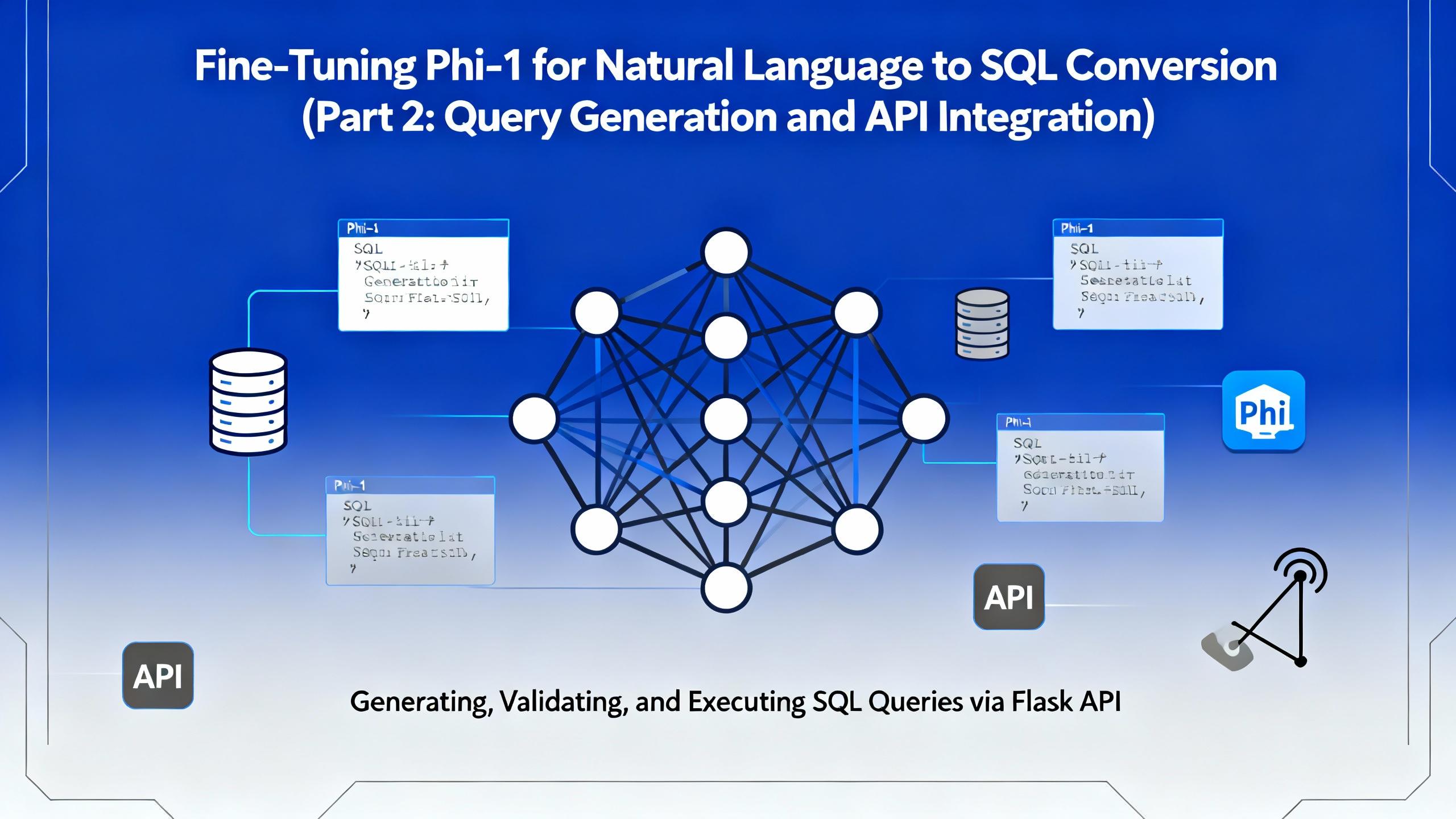
In the second part of this series, we move beyond model training and bring our fine-tuned Microsoft Phi-1 to life. This article focuses on query generation, safe SQL execution, and building a Flask-based API that allows real-time interaction with financial databases.

In today’s data-driven world, being able to query databases with natural language is becoming increasingly valuable. Imagine simply typing: “Show me the total interest income of Kumari Bank in April 2022” and instantly receiving a valid SQL query (and even the corresponding chart!) — no manual SQL writing required.

Discover the power of vibe coding building a Discord attendance bot with AI, transforming a clunky biometric system into a modern solution. Learn how AI-driven development can revolutionize your business, contact DalloTech for custom solutions!

Explore the essentials of IP binding in Dockerized applications with this insightful Dallo Tech blog post. Gain expert tips and best practices to optimize your containerized workflows effectively.
